
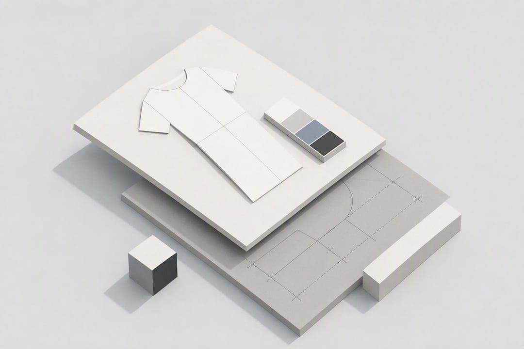
A production-ready clothing brand design sketch is not a pretty drawing. It is a working document: a croquis-based figure showing a clear silhouette, an annotated flat with construction notes, and at least one fabric or trim suggestion that a factory could act on without asking questions. Get those three elements right and you have a sketch that carries a garment from your notebook into a sample room.
TL;DR:
- A clear, annotated technical flat with detailed construction, measurements, and fabric notes is essential for factory production, while croquis illustrations focus on mood and drape.
- Consistent use of a single croquis scale and pose throughout a collection improves proportion accuracy and facilitates comparison across garments.
- Starting from a curated moodboard, designers must transform inspiration into distinct silhouettes through quick thumbnail sketches, then develop the best option with fabric behavior and front-back clarity.
- Digital tools like vector software produce crisp technical flats, while AI-generated sketches speed up visual development but require manual refinement before sending to factories.
- Well-structured presentation files with one hero sketch per page, fabric swatches, close-up details, and concise annotations streamline communication with buyers and manufacturers.
Table of Contents
- What is a clothing brand design sketch, exactly?
- How do you turn inspiration into a finished sketch?
- What technical information does a factory actually need?
- Which digital and AI tools actually help?
- How should you present a sketch to buyers or factories?
- Getting croquis proportions right from the start
- Turning a moodboard into an actual design direction
- Methods for adding texture, colour, and pattern to sketches
- Weaving brand identity into every sketch
- Best practices for revising and iterating sketches
- Annotating sketches with measurements and construction detail
- Where sketching fits in a modern brand workflow
- Turn a garment idea into a sketch and tech pack faster
- Sources
- FAQ
What is a clothing brand design sketch, exactly?
The industry term for what most people call a "clothing brand design sketch" is a fashion design sketch, and it usually comes in two forms working together: a croquis illustration (the artistic, proportioned figure showing mood and drape) and a technical flat (the flat, unstyled line drawing used for production). Beginners often conflate the two, but a factory needs the flat, not the croquis, to cut fabric.
Here is the toolkit that gets you from a blank page to both, without wasting money on kit you will not use.
- Croquis templates at a fixed scale (9 heads is standard for fashion proportion) so every garment in a collection sits on the same base figure.
- Tracing paper and a light box for repeating a croquis quickly across multiple design variations.
- A range of pencils (2H to 2B) and fine-liner pens for line weight control between construction seams and decorative stitching.
- Markers or coloured pencils for quick fabric and colourway tests before you commit to digital colouring.
- A drawing tablet and stylus (an iPad with Apple Pencil is the most common indie setup) once you move sketches digital.
- Raster software such as Procreate for expressive illustration, rendering drape, texture and shading.
- Vector software such as Adobe Illustrator for crisp, resizable technical flats, the industry standard for production drawings.
- A dedicated tech-pack tool once you are ready to bundle sketches with specs, measurements and grading into a document a factory can quote from.
Build or buy your croquis set once, at one scale, and reuse it for the whole collection. Consistency there saves hours later.
How do you turn inspiration into a finished sketch?
Most designers skip straight from a Pinterest board to a finished drawing, and it shows. Buyers and factories can spot a sketch that copies a reference rather than interprets one, so build in a step that forces transformation before you pick up a pen.
- Build a tight moodboard. Five to eight images maximum, pulled from outside fashion where possible: architecture, textiles, nature, film stills. Pinning fifty images produces noise, not direction.
- Run a transformation checklist. For every reference, force one major change (silhouette or construction) and one supporting change (material or proportion), a method Milan Fashion Campus recommends specifically to avoid producing designs that read as derivative.
- Thumbnail fast. Draw six to ten small silhouette options per garment in under ten minutes each. Speed matters more than polish at this stage.
- Shortlist two or three. Pick the thumbnails with the strongest, clearest silhouette story and drop the rest without sentiment.
- Dress the croquis. Add the garment to your standard base figure, working out drape, seam placement and proportion before any colour or texture.
- Render fabric behaviour. A stiff denim reads differently to a fluid silk on the page. Sketch the fold and fall, not just the outline.
- Check front and back clarity. A sketch that only shows the front leaves a pattern maker guessing at closures, pocket placement and back yokes.
- Annotate the final sketch. Add construction notes, key measure points, and a one-line fabric suggestion directly on the drawing.
Fashion sketching works best as visual storytelling built on a disciplined foundation, and Istituto Marangoni teaches croquis-first for exactly this reason: proportion errors compound at every later step, from illustration through to pattern cutting.
Pro Tip: Keep your thumbnails on one page, side by side. Comparing eight rough silhouettes at a glance reveals your strongest idea faster than judging each one in isolation.
What technical information does a factory actually need?
A tech flat is the unglamorous drawing that gets your garment cut correctly, and most new designers underdress it, not overdress it. Skip the shading and styling; a factory wants clarity, not art.
- Front, back, and detail-zoom views. Any complex seam, pocket, or closure gets its own close-up rather than a crowded main drawing.
- Clean seam and stitch lines, drawn as distinct line weights from the outline, so a pattern maker cannot mistake a decorative topstitch for a structural seam.
- Key measurements at chest, waist, hip, length and sleeve, taken flat rather than on-body.
- Fabric weight notes (in grams per square metre where you know it) alongside any stretch or drape requirement.
- Trims and hardware callouts, naming buttons, zips, and labels with size or type where possible.
- Tolerance and grading notes written as simple ranges rather than paragraphs, for example "bust ±1cm across sizes."
A tech flat missing even one of these tends to trigger a round of clarifying emails before a sample gets cut, which is the exact delay a clear sketch is meant to prevent.
Which digital and AI tools actually help?
Three broad approaches dominate right now, and each does one job well.
- Raster illustration (Procreate and similar) handles expressive, textured croquis work: drape, shading, mood. It is the weakest choice for anything a factory needs to measure from.
- Vector flats (Illustrator) produces the crisp, resizable technical drawings factories expect, but building a flat from scratch takes real skill and time.
- Sketch-to-image and AI generation tools turn a text description or rough sketch into a finished visual fast, which speeds up buyer decks and internal reviews. The Fabricant notes these tools accelerate visual decision-making but still need manual refinement before the output is manufacturer-ready.
The strongest workflows blend approaches rather than picking one: hand-sketch the croquis for creative control, then rebuild the flat in vector software for production accuracy. Or start with an AI-generated concept and refine it manually once the direction is approved.
This is precisely the gap Wovaai is built to close. Describe a garment idea in a few sentences and the platform generates a full concept, professional sketch included, alongside a manufacturer-ready tech pack covering specs, construction and fabric detail. It will not replace judgement on fit or fabric behaviour, but as a starting point for speed, it removes hours of blank-page work.
Pro Tip: Never send an AI-generated sketch straight to a factory. Treat it as your fast first draft, then check measurements and construction notes by hand before it goes anywhere near a cutting table.
How should you present a sketch to buyers or factories?
A single, well-organised page beats a folder of loose files every time. Structure your presentation the same way for every garment so buyers can flip through a range without relearning your layout.
- One hero sketch per page, front and back, with the silhouette clearly readable at a glance.
- Fabric swatches or close-up photos pinned or pasted beside the sketch, never described in text alone.
- Detail close-ups for any zip, pocket, or trim that needs clarification.
- Concise annotations, three to five lines, not paragraphs, covering fit, fabric and finish.
- A one-line concept statement at the top: what the garment is and who it is for.
For file formats, export a flattened PDF for buyer decks, keep a layered AI or SVG for anything you will need to edit later, and save a PNG for quick sharing over email or messaging apps. Name files consistently, for example Brandname_Style012_Front_v2.pdf, so nobody hunts through folders during a fitting deadline. When you are ready to sample, attach your sketch, spec sheet and fabric reference in one email and state your target sample turnaround upfront.
Getting croquis proportions right from the start
Every professional fashion sketch starts from a croquis, a proportioned stick-figure template that stretches the human body into an idealised fashion silhouette, typically nine heads tall rather than the anatomically accurate seven and a half. That extra elongation through the legs and torso is deliberate: it gives clothing room to read clearly on the page, the same way a shop mannequin flatters a garment more than an average body does.
Beginners often draw the garment before locking the pose, which is backwards. Fix the croquis pose first: weight on one hip, shoulders angled, a clear centre-front line running from neck to hem. Only once that skeleton is settled should you drape fabric over it. Istituto Marangoni teaches this sequence specifically because proportion mistakes made at the croquis stage carry through every later drawing, and they are far harder to fix once a garment is sketched on top.
For a small collection, discipline matters more than variety. Pick one croquis, one scale, one pose family, and reuse it for every garment. A jacket and a dress drawn on two different body proportions will never sit convincingly side by side in a buyer deck, even if each drawing is individually strong. Buy a printed croquis pack, trace one from a course like Domestika's fashion sketching series, or build your own template once and duplicate it digitally. The time you save reusing a fixed base easily outweighs the hour it takes to build one properly at the start.
Turning a moodboard into an actual design direction
A moodboard is not decoration. It is the translation layer between a feeling and a garment, and most beginner boards fail because they stay too visual and never get converted into concrete choices.
Pulling references from outside fashion, architecture, film, geology, tends to produce more original results than pulling from other clothing brands, simply because there is nothing to copy directly. The skill lies in cross-modal translation: taking an abstract quality, the sharp angles of brutalist architecture, the movement of water over stone, and converting it into concrete silhouette, material, colour and texture decisions a sketch can actually show.
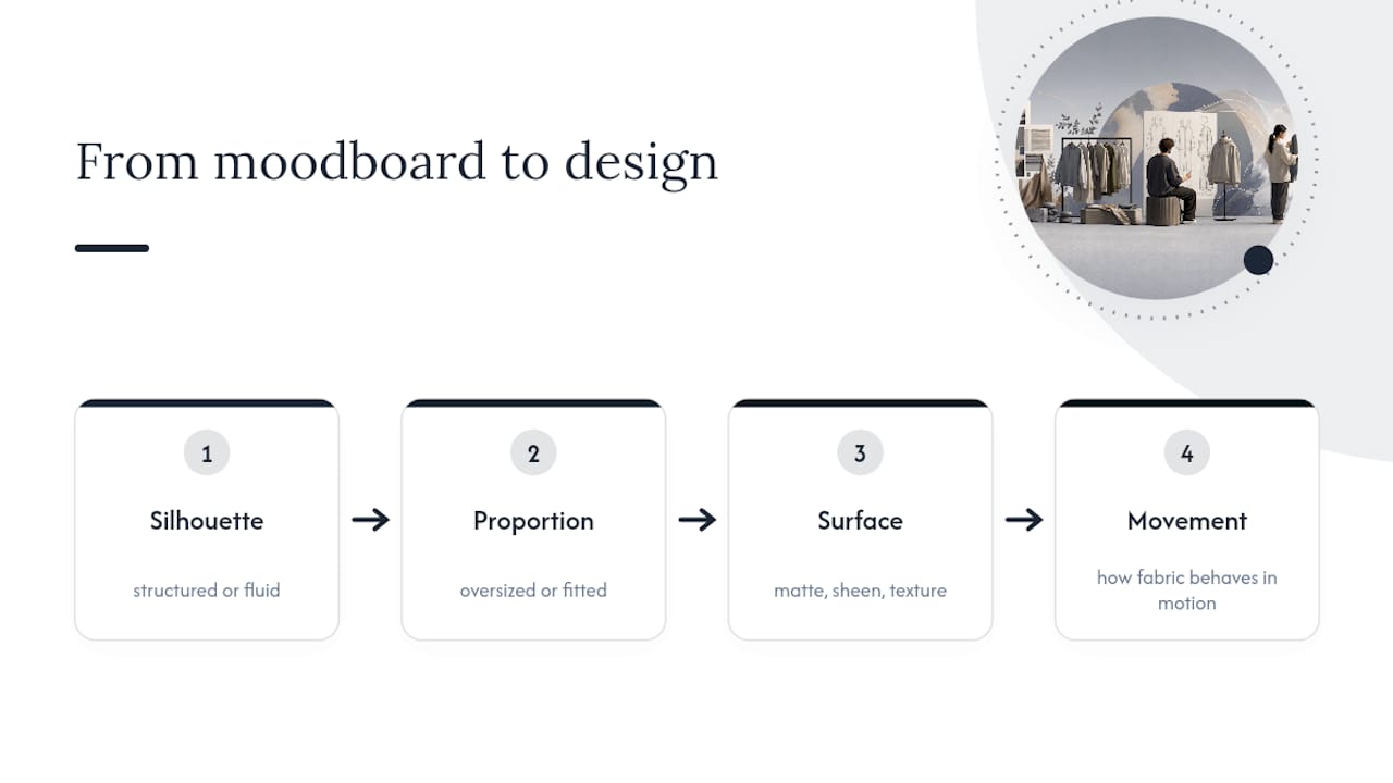
Work through four variables for every reference image: silhouette (structured or fluid), proportion (oversized or fitted), surface (matte, sheen, texture), and movement (how the fabric behaves in motion). Assign each reference a specific answer for each variable rather than leaving it vague. A photo of cracked desert clay might translate to a structured silhouette, a matte surface, and almost no drape, quite different design instructions to the same image read purely as "texture inspiration."
This discipline is what separates interpretation from copying. Cross-modal translation is a teachable, repeatable process, not an innate talent some designers have and others do not, and running every reference through the same four questions gives you a defensible design direction rather than a mood you cannot quite explain to a factory.
Methods for adding texture, colour, and pattern to sketches
Rendering fabric behaviour convincingly is what separates a flat outline from a sketch that actually communicates the garment. Denim, silk and boiled wool all fall differently, and a sketch that treats them the same misleads whoever reads it next.
For texture, use line weight and shading rather than literal detail. Short, broken strokes suggest boucle or tweed; long, smooth curves suggest silk or satin drape; cross-hatching in the shadow areas suggests structured or heavier cloth. Markers work well for quick colour block tests because they dry fast and layer cleanly, while coloured pencils give you finer control over gradual shading, useful for showing how light falls across a curved seam or a gathered sleeve.
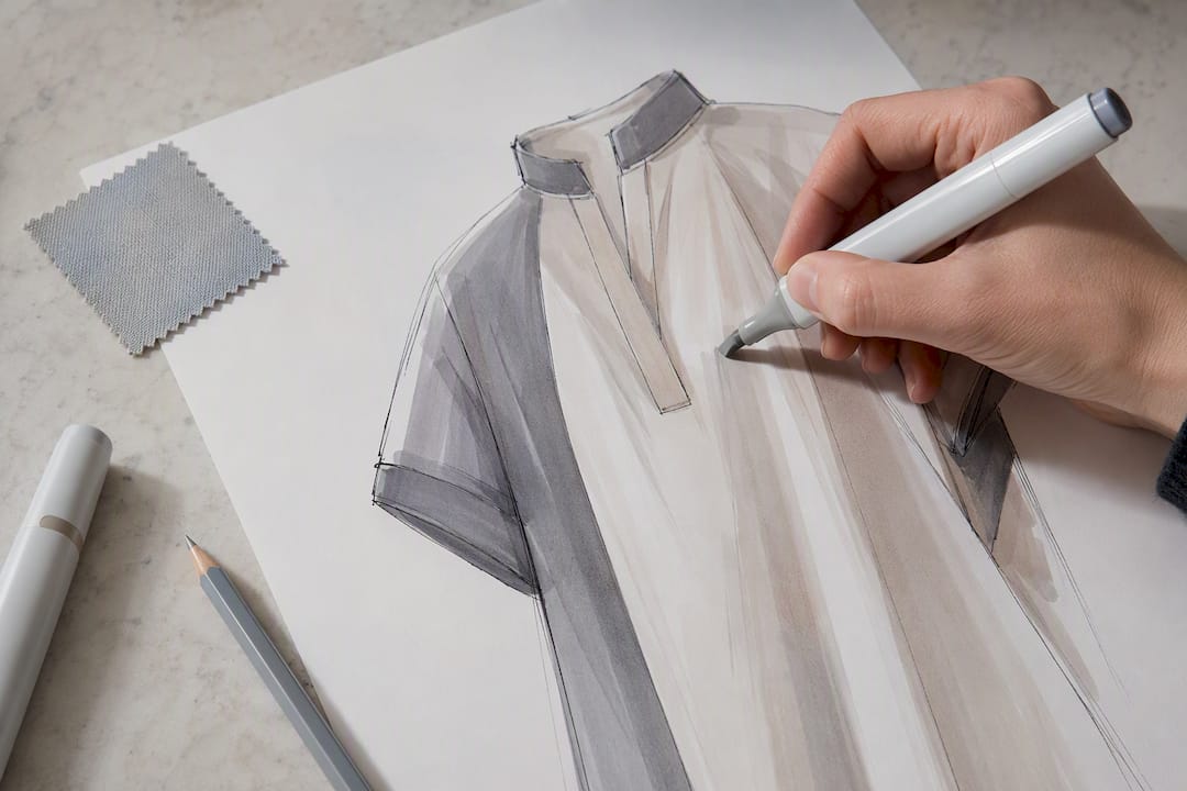
For colour, work out your palette before you start rendering individual sketches, not garment by garment. A collection with five inconsistent colourways looks unplanned even if each drawing is well executed. Build a small swatch strip alongside your croquis and refer back to it constantly.
For pattern, sketch the repeat at actual scale wherever possible rather than a generic zigzag standing in for "print." A stripe that is 2cm wide reads completely differently on a garment to one that is 8cm wide, and a factory working from a vague pattern indication will guess, often wrong. If you are working digitally, build the pattern as a repeating tile in vector software and drop it over the flat so the scale stays accurate when the file is resized or printed at different dimensions.
Weaving brand identity into every sketch
A sketch should look recognisably yours before anyone reads a label. That starts with small, repeatable signature choices rather than a logo slapped on somewhere in the drawing.
Pick two or three recurring silhouette habits and apply them across the collection: a signature sleeve shape, a consistent hemline treatment, a particular pocket placement. Buyers flipping through a range remember shapes faster than they remember colour, so a repeated silhouette cue does more brand-building work than a repeated print.
Colour discipline matters just as much. Define a core palette of four to six colours for the season and let every sketch draw from it, rather than introducing a new shade for every garment. This is also where fabric choice becomes a brand signal: a brand built on structured tailoring should show that stiffness consistently across sketches, while a brand built on fluid, draped silhouettes should render drape the same way every time.
Annotation style is a quieter but equally real brand cue. Standardise your font, your callout symbols, and your layout for every technical flat. A buyer or factory contact who sees ten sketches from you across a season should recognise your annotation style before they check the name on the file. None of this needs a formal brand guideline document at the sketch stage; three or four consistent rules, applied every time, are enough to make a collection read as a single coherent point of view rather than ten unrelated garments.
Best practices for revising and iterating sketches
Nobody nails a garment on the first drawing, and treating early sketches as precious slows a collection down. Draw fast, judge harder, and expect to throw away most of what you produce in the first pass.
Separate your revision rounds by purpose rather than mixing everything into one messy edit. Round one fixes silhouette and proportion only, ignore fabric and colour entirely at this stage. Round two addresses construction detail: seam placement, closures, pocket positions. Round three handles fabric rendering and colour. Trying to fix all three at once usually means you end up polishing a silhouette that should have been scrapped.
Keep every version rather than sketching over the top of the last one. Save iterations as Style012_v1, Style012_v2, and so on, because the second or third version you rejected sometimes turns out to be the stronger direction once you have lived with the "improved" one for a day. A single croquis scale and body type across the whole collection, as recommended by fashion sketching tutorials aimed at beginners, also makes it far easier to compare revisions side by side, since you are judging silhouette changes rather than fighting inconsistent proportions between drafts.
Get a second pair of eyes before you finalise anything destined for a factory. A pattern maker or experienced sample machinist will catch construction problems a purely visual review misses, things like a collar stand that cannot physically sit the way it is drawn, or a closure that assumes fabric behaviour your chosen cloth will not actually deliver.
Annotating sketches with measurements and construction detail
An unannotated sketch, however beautifully drawn, is not a production document. Annotation is where a sketch stops being art and starts being an instruction set.
Place measurements directly on the flat using clean callout lines rather than a separate table wherever possible, since a factory worker cross-referencing a drawing against a written spec sheet is a step that introduces error. Standard callouts include chest or bust width, waist, hip, garment length, sleeve length, and armhole depth, each measured flat rather than on-body.
Construction notes need to be specific rather than general. "Reinforced seam" tells a sample machinist nothing useful; "double-stitched seam, 1cm from edge" does. Note seam type (French, flat-fell, overlocked), closure mechanism (concealed zip, exposed metal zip, button placket), and any topstitching that is decorative rather than structural, since those two can look identical on an unannotated line drawing.
Always include a one-line fabric suggestion even when the final fabric decision is not locked, something like "mid-weight cotton twill, minimal stretch" gives a sample room a starting point rather than a guess. Where sizing spans a range, write tolerances as simple plus-or-minus figures next to the relevant measurement, for example "waist ±1.5cm," rather than burying grading logic in a separate document the factory has to hunt for.
Where sketching fits in a modern brand workflow
Clear sketches shorten sample cycles because they remove the guesswork that triggers expensive revision rounds. Our rule of thumb: sketch in-house when creative control matters most, lean on a platform for speed and tech-pack conversion once the direction is set. Either way, the next steps are the same: build one clean spec page, request a sample, iterate against what comes back.
— WOVA Editorial Team
Turn a garment idea into a sketch and tech pack faster
The platform delivers two key outputs this entire process is built around, a professional sketch and a manufacturer-ready tech pack, generated from a short written description rather than hours at the drawing board. That is the real contrast with the manual workflow covered above: instead of sketching, rebuilding in vector software, and writing specs separately, you describe the garment once and get both deliverables together.
Before you start, have your core idea written in a few sentences: silhouette, fabric direction, and the market you are designing for. That gives the platform enough to work with on the first pass. From there, treat the output the way you would treat any first draft sketch, check it, refine construction notes where needed, and use it as your starting point for sampling rather than a final answer.
If you are an independent designer or small brand trying to move faster from concept to sample, try WOVA and see what a first draft looks like against your own idea.
Sources
- How to perfect your fashion sketches - Istituto Marangoni Miami
- Find fashion inspiration without copying other brands - Milan Fashion Campus
- The fashion designer’s tactile node network - Build First Brain
- Sketch to Image AI | Fashion Design Tool - The Fabricant
FAQ
What is a clothing design sketch called?
The professional term is a fashion design sketch, which usually splits into two types: a croquis illustration for mood and proportion, and a technical flat for production. Most working designers use both across a single garment.
How do you make a clothing design sketch?
Start with a proportioned croquis template, thumbnail several silhouette options quickly, then develop your strongest one with fabric rendering and construction detail. Finish by annotating the sketch with measurements, seam notes and a one-line fabric suggestion so it can move into sampling.
What is the best sketch app for clothing design?
There is no single best app; it depends on the output you need. Procreate suits expressive croquis illustration, Adobe Illustrator suits precise vector flats for production, and platforms like Wovaai suit turning a written idea directly into a sketch and tech pack.
What do fashion designers use to sketch?
Most designers combine traditional tools, croquis templates, tracing paper, pencils and markers, with digital tools such as a tablet, stylus, and raster or vector software once a sketch moves toward production. The mix depends on whether the sketch is for creative development or factory handoff.